
One of our newest services is the Private Marketplace. It is used for arranging so-called Private Deals in the online advertising business. For example, the sales agent of aktualne.cz will negotiate a deal with the car brand Škoda and offer them the possibility to buy mobile advertising on their website in the Auto category webpages for the price of 8 CZK per thousand views, while a normal market price is 10 CZK. That agreement is then entered into the system by the sales agent and that system is the Private Marketplace.
An important part of this system is a tool that checks whether Škoda is actually buying the ads – this tool is called Deal Check. After all, there are plenty of holes along the way where Škoda´s advertising can fall in and the end-user will see an advertisement for something else in the browser. For example, Škoda may try to buy a square 300px × 300px ad in Chrome browsers on iPhones and is only interested in the people who are currently in South Moravia. And it may happen that there are very few people in a day who fit in that combination. Deal Check aims to show in which step the most users have been lost (have we lost more by focusing on South Moravia, or because of iPhones?). As a result, Škoda may notice that the biggest problem is the ad format. So they will create a 300px × 100px banner in addition to the 300px × 300px advertisement, which may result in a tenfold increase of the number ads displayed .
We used to run an old version of Private Marketplace, which also contained Deal Check. It was a hard-to-understand table with a lot of labeled numbers that anyone could hardly understand. It was one of those “from programmer to user” designs. Knowledge of this tool was passed down from generation to generation — it wasn’t even possible to do otherwise. When we were programming the new Private Marketplace, we decided to try something better. Our goal was to create a Deal Check so that anyone, even an inexperienced person, would be able to see at a glance at which step the most ads were lost. And at the same time, the tool would tell them what they could do to solve that loss.
We identified the users who will be using the new Deal Check, prepared a set of questions, and started interviewing them. After the previous experience, we decided to have the interview sessions only between two people, not in a group. One of the reasons behind this decision was the fact that in a group interview with ten people, it naturally occurs that the most communicative ones get to express themselves and the remaining nine people remain silent. By combining questionnaires that users could fill out and interviews in two people, we got a fairly accurate picture of what information they needed to see in the tool. Not how it is supposed to look, but what information they want to read from there.
Designing a new Deal Check
At this point, the design phase of the tool began. The hardest part was figuring out how to visualize the losses, which there were too many of even under normal conditions. Let’s say a million people come to visit aktualne.cz every day. But we will only show Škoda’s ad to 100 of them and not to 999,900 other people. This is not an exceptional case, rather a common one. And we need to visualize the 999,900 loss and also the reasons why we didn’t show the Škoda ad. We want to show users that we filtered 300,000 people because they had a different browser, another 600,000 were not from South Moravia, another 50,000 had no iPhone and so on. If we were to display this using regular columns with a classic linear scale, the first column would be showing a million users and it would be ten thousand times larger than the last column with a hundred resulting views.
After a long struggle, we finally came up with two proposals. The first was the “dice arrow chart.”
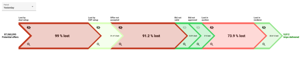
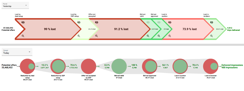
In the beginning, we defined some steps or phases that occur during an attempt to display an ad. There are seven steps, and each step typically filters out a portion of users. This “dice arrow chart” represented each step as an arrow pointing right. On the left, we start with 87 million potential users, and in every step we lose some of them. The red arrow indicates the loss was large, the green shows that the loss was small. At the end of the chart, we can see that we displayed an ad only to 9,812 users out of the total.
The second design was called the “pie chart” and used pies:
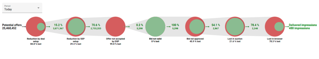
Again, the chart showed phases and a gradual loss of users. The red part was the loss in the given step, the green part was the amount that was passed to the next step.
Choosing the winner
Because we couldn’t decide which version should win, we decided to develop both and do A/B testing. The idea was that we really would develop both versions to be fully functional and monitor which version is preferred by users. It was the first such attempt for us, we have never really tried to develop two fully functional versions of one tool. We would then keep the users’ preferred version and delete the other version. We figured if we didn’t know which version was going to win anyway, we’d just try to program it in a hurry, make it work somehow, and rewrite the winning version properly. We wanted to get the result as fast as possible.
We used the Hotjar tool for evaluation. It can record how users navigate on the web and how they use it. So we had videos of users’ actions and we could observe which version they preferred and what kind of trouble they were having with both versions. After a few weeks, we had a winner. The Pie chart steamrolled the Dice chart 5:1 in a vote that ran concurrently. You read right, five to one indeed. There was one paradoxical situation: the old Private Marketplace had to be used by a fairly large team of people. However, when we created the new Private Marketplace, we tried to make a lot of the tasks more sophisticated and simple. As a result, it took far fewer people to operate the new version of the Marketplace. The Luddites warned us about this right, machines take people’s jobs!
After about two months, we were clear about the winner and we wanted to rewrite the winning option to meet all our demanding standards for nice and clean code. We deleted all the code, used TDD and paired programming, and three weeks later it was done. Then, we woke up from the dream. After two months, we found out that the team that developed Private Marketplace no longer exists. People were assigned to other tasks. A quick glance at the code told us it wasn’t all that bad, and we let it be. It’s still working, users are happy, but it’s not ideal.
What lessons have we learned from this?
- At any stage of the design, we do not have to make our own decisions. When we weren’t sure about what users expected from Deal Check, we asked them. When we needed help designing the look, users evaluated what they found clear and what they didn’t. And finally, when we had two final versions and we couldn’t decide between them, we programmed both and let users decide.
- “Now we will develop it quickly and carelessly, we’ll rewrite it later” just doesn’t work, even though we told ourselves at least ten times that there will be a time for a rewrite. Uncle Bob says the only way to go fast is to go well. Even when you are programming a prototype that you know you are going to throw away someday, it’s ultimately quicker to program it right the first time. Otherwise, it just doesn’t work.