
It was just one of those regular meetings with users. We had recently rolled out a new product and our users had had a chance to work with it for some time. This meeting was about their latest experiences, comments, and ideas for improvement which we were happy to gather. One of these ideas was the ability to see the statistics in the product. This new product contained a list of advertising positions, the places on the page in which an ad can appear. You may be familiar with the term “ad-slot”. The idea was that the list of such positions would also contain numbers, for example how many ads were displayed in each position. This data is currently available in the reporting system, which gathers numbers from all our products. Based on the users’ point of view it would be good to have such statistics available on the mentioned list of advertising positions.
As usual, we made notes and then implemented the requirements step by step. We selected the issues based on criteria, for example how often it was repeated, how long the issue had been on our list, how useful it seemed to us, or how simple the implementation seemed to be. And since this particular request kept appearing during other meetings, we decided to fulfill our users’ wishes.
At first, the whole matter seemed simple – we will just add a few statistics to the already existing list. We remembered that we actually already have an older product that is connected to the reporting system. Therefore, obtaining such statistics and then displaying them is not unknown to us. Thus users will see the numbers they were dreaming of and it won’t cost us too much effort. A clear win-win situation. So we started our analytical-design train with the destination being the statistics in our system. However, during the discussions, a question arose: “Why do they want to see the statistics at all? What problem does it solve for them?”
We did not have any difficulties answering such questions. After all, we had extensive experience with statistics and reporting systems. We also had our Customer Care team at hand, which is basically also a user who encounters similar issues on a daily basis. Together, we answered the questions that were asked and we kept asking new ones at the same time: “Why do the users need the statistics? If they use these statistics to monitor the performance, wouldn’t it be better to also include the information about the last week’s performance? What about trends?” We could display whether the numbers of rendered ads increased or decreased in comparison to the previous week. But if we are really interested in trends, can we somehow look at the historical data and show what are the usual values? This way the user would clearly see whether the current performance is within the usual range and, if not, he can react immediately to the situation. All these questions kept rising as our analytical-design train was picking up speed. But no one noticed that we were on the wrong track. But let’s come back to that later.
Together we created a clear picture of what issues our users are facing and what is the best way to solve them. All this joint effort resulted in this beautiful chart. Isn’t it beautiful?
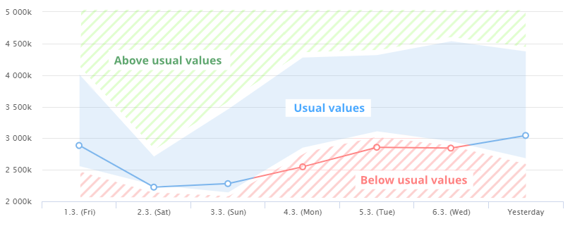
This “masterpiece” is a result of multiple iterations. It was preceded by several prototypes, which were discussed in many meetings with colleagues from various departments. We were patting each other on the back. After all, we managed to transform the original request into a perfect form that will dazzle the users. We also kept some extra ideas up our sleeves that will improve this already beautiful chart in the future, such as visualization of special events that could affect the performance, like the start of the Olympic Games. That means our user would see that any increased and out of the usual range performance of the advertising position is likely the result of this event and there’s no need to address it further.
Meanwhile, we were 100% sure that our efforts would result in either charts or statistics. Why slow down development then? We could already start working on obtaining data from the reporting system. And we should also start researching which software we will use for the rendering of charts. Everything was ready, the only thing missing was to present it to the end-users.
We planned the meeting properly. First, we will show users a simple prototype that would just show statistics in the application. And then we dazzle them with our great chart. However, something unexpected happened… despite all our assumptions, users were not jumping through the ceiling with enthusiasm. According to their comments, it was something they didn’t necessarily need, but it was good otherwise. Maybe with just a few small adjustments… this left us a bit speechless. We felt that something wasn’t right. Is it possible that our perfect solution is not as perfect as we thought? Or is there a chance that it is not the right one at all? Therefore, we decided to schedule another meeting.
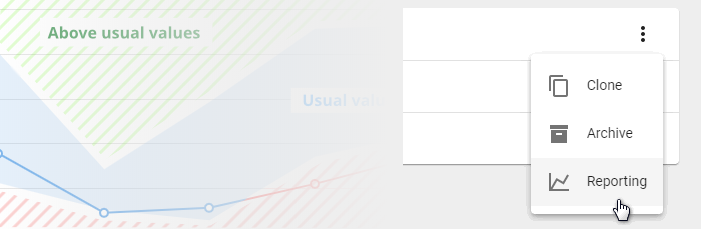
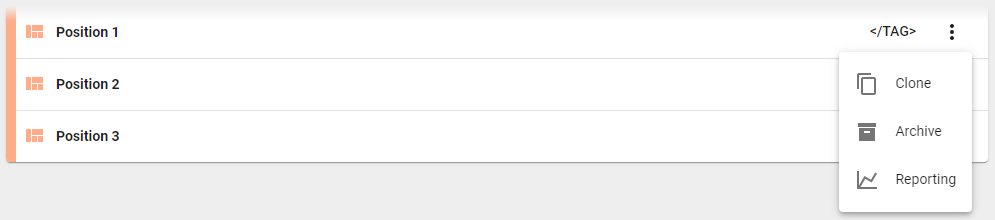
During the next meeting, we focused on what specifically our users need to do. After a short discussion, we learned that the biggest challenge for them is that it is difficult to get the ID of an ad-slot from the application. This ID is then inserted into the system which generates a report for the ad-slot. After a brief verification, we solved this problem by adding a simple button to our application. Clicking this button immediately opens the report for the given ID. We struck gold with a little effort, don’t you think?
What lessons did we learn?
Don’t be afraid to be a detective while you’re collecting feedback. In this case, the user had already come to us with a solution, to see the statistics, not with the actual problem. And how should a detective operate in such situations? It’s simple. You need to gradually extract the whole context from the user. If the user tells you that he is missing the statistics in the application, ask him to elaborate on that. Let him guide you through his entire work process. Feel free to start in the morning, when he comes to the office and makes a coffee. Let him walk you throughout his day. How exactly does the user reach the point when he says to himself “Statistics would be useful here,” What actions preceded it? There is no such thing as too many questions. You may not want to bother your users too much, but it’s the questions that will lead you to the heart of the problem. It will help you to come up with the right solution. Be the annoying gentlemen dressed in the rumpled beige raincoat.
Keep the user involved throughout the entire process; the feedback loop needs to be there. In our case, we wanted to impress the users. We didn’t want to show them something we wouldn’t like. Instead, we decided to include our Customer Care team, because we were convinced that they had the same problem. It was easier for us to ask them. If we were to show users one of the first sketches, we could easily check if we were on the right track or not. The user that is involved in these early stages can often confirm whether you are on the right track or not. And save you not only a lot of time, but especially a lot of money.
And last but not least – prioritization. This escapade forced us to think about the prioritization of work items. We wanted to solve this specific issue because it kept appearing during conversations and because it was a trivial one at first glance. However, while presenting our perfect solution, it was clear that even though our users liked the charts, there was perhaps something more important for them that needed solving. We learned not to treat our users as isolated user groups. We decided to force them regularly into a single room where everyone can use this opportunity to pass on feedback and discuss what is important and why. Thanks to these joint meetings we ensured that the next thing that we will be implementing will be the item that all of our users have agreed upon. And we also get to do some useful detective work during these meetings.
Our story also has one happy ending – since we were sure at the very beginning that we would definitely work with data from reporting in some form, we created a library for obtaining them. But in the end, it remained untouched. But some time ago we dusted it off and eventually used it in a completely different project. Not everything was in vain. But would we have to deal with it if we actually did things as we described in the lessons that we learned?